DATE
12/05/2026
Quit Forever
Designed to bridge the gap between medical authority and human warmth to empower patients through a seamless telehealth journey.
Telehealth
HealthTech
Services
UI/UX Design
Category
Telehealth Landing Page
Client
Not Specified
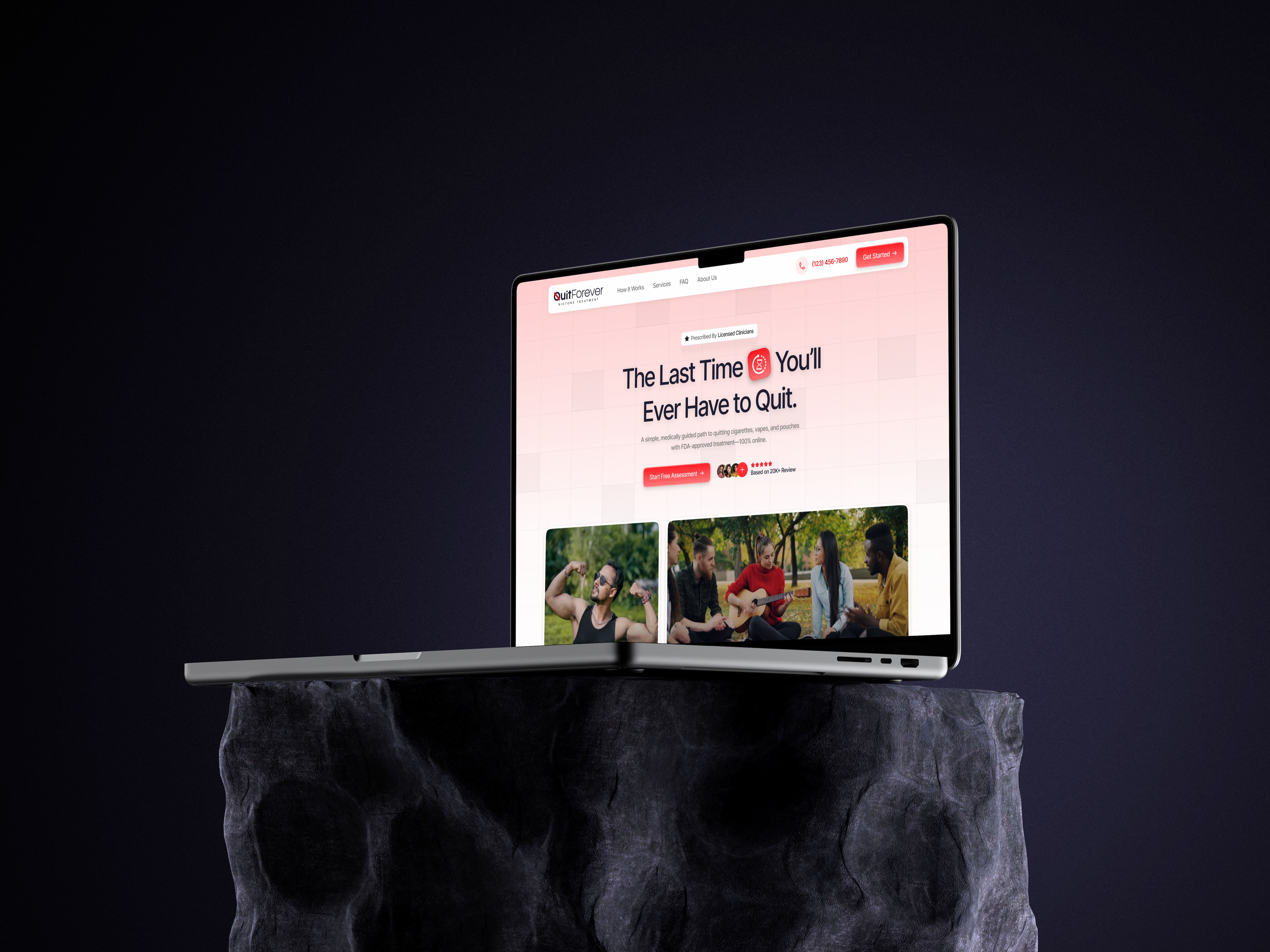
Quit Forever — Telehealth Landing Page
Designed to bridge the gap between medical authority and human warmth to empower patients through a seamless telehealth journey.
01. Executive Summary
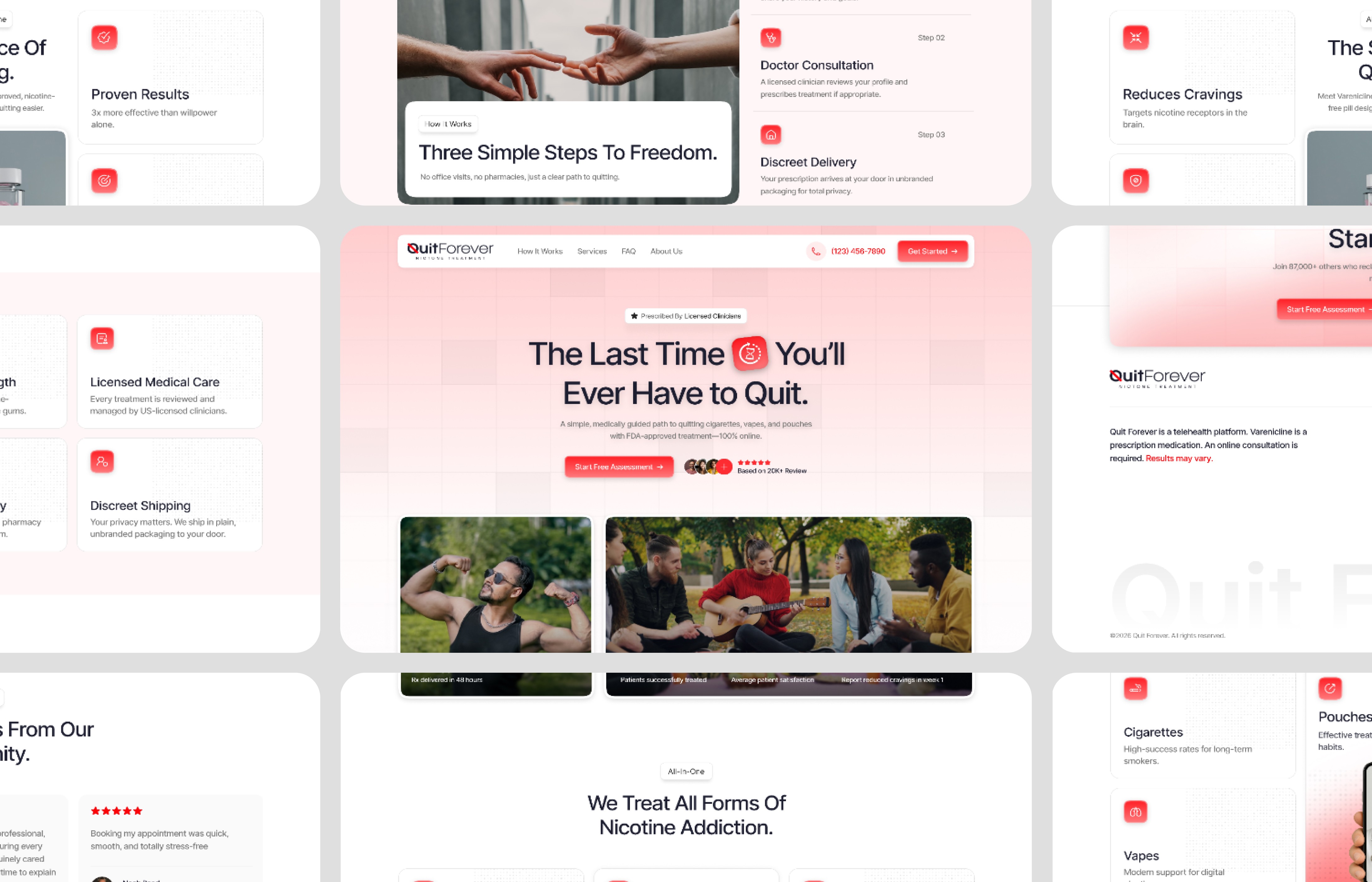
Quit Forever is a premium nicotine cessation platform that provides a medically guided path to quitting. The goal was to design a high-conversion landing page that translates complex telehealth procedures into a clear, trustworthy, and actionable user experience. By utilizing a modern bento-grid structure, I transformed a high-stakes health decision into a seamless digital journey.
02. The Challenge
Telehealth platforms often struggle with two extremes: they are either too "clinical" and intimidating, or too "tech-heavy" and untrustworthy. The challenge was to organize a massive amount of clinical data—including addiction types, medical treatments, and patient testimonials—without overwhelming the user or losing the sense of professional authority.

03. Strategic Pivot
Instead of a traditional long-form sales page, I pivoted to a Modular Information Architecture. By breaking the content into a bento-grid layout, I gave the user "digestible chapters." This allows the patient to scan for what is relevant to them (e.g., Vapes vs. Cigarettes) immediately, reducing cognitive load and increasing the likelihood of a conversion.

04. Core Design Solutions
Bento-Grid Logic: Created a structured visual hierarchy that organizes diverse content types into a unified, clean aesthetic.
Trust Signals: Integrated high-fidelity social proof and clinician-verified badges directly into the hero and service sections to build instant credibility.
Section Tinting: Used subtle background shifts to eliminate "white-wall fatigue," guiding the user through the long-form scroll without losing engagement.
Frictionless CTA: Designed a clear, bold "Start Free Assessment" flow that stands out against the medical palette to drive immediate user action.
05. Visual Identity & Final Result
The visual direction uses a sophisticated Navy Blue (Authority) and Vibrant Red (Urgency/Action) palette. I paired this with clean, sans-serif typography and high-quality product photography to create a premium feel. The final result is a professional, high-performance telehealth interface that doesn't just inform users—it empowers them to take the first step toward a healthier life.



FAQ
